Flutter is an amazing framework for app development, and gaining popularity every second. Being component and composition based, and with the fact that it includes many built-in widgets to work with, it’s really easy to create beautiful widgets, either simple or complex.
Today we’ll be learning how to create a real-world case widget for updating a numeric value - a pitch-knob-like control. Like the ones you can usually find in a studio. It will also support letting the finger go to keep rolling in the same direction, and using the velocity it was left with.
In this tutorial, we will:
- Create a stateful widget
- Use
GestureDetectorto detect scroll gestures for us, and update the callbacks appropriately.
This tutorial assumes you have some experience with Flutter and understand basic Widget composition and basic state management.
Step 1: Create the Widget
We’ll start basic. We have one base stateful widget, which will hold everything. In this example, I’ve already added some parameters we will need to accept:
class WheelSpinner extends StatefulWidget {
  final double max;
  final double min;
  final double value;
  final Function(double value)? onSlideUpdate;
  final Function(double value)? onSlideDone;

  WheelSpinner({
    required this.value,
    this.max = double.infinity,
    this.min = double.negativeInfinity,
    this.onSlideDone,
    this.onSlideUpdate,
  });

  @override
  _WheelSpinnerState createState() => _WheelSpinnerState();
}

class _WheelSpinnerState extends State<WheelSpinner> {
  late double value;

  @override
  void initState() {
    value = widget.value;
    super.initState();
  }

  @override
  Widget build(BuildContext context) {
    return Container(child: Text(value.toString()));
  }
}
As you can see, we are accepting a min, max, and current value to use with the widget. We are
also accepting callbacks for when updating (while sliding) and when done (when finger is let go
and the “fling” duration is over), which we will call once we update the actual value.
Let’s give it some shape
Right now our widget is completely empty, except for that little Text widget to see our current
value, so let’s do some styling. For this example, We will be creating a rounded, tall box, which
will contain some separation lines, and maybe some shade or gradient.
Let’s update our build method:
@override
Widget build(BuildContext context) {
double shadowOffset = 0.2;
return Container(
width: 60,
height: 100,
decoration: BoxDecoration(
gradient: LinearGradient(
begin: Alignment.topCenter,
end: Alignment.bottomCenter,
stops: [0.0, shadowOffset, 1.0 - shadowOffset, 1.0],
colors: [
Colors.grey[350],
Colors.grey[50],
Colors.grey[50],
Colors.grey[350]
],
),
border: Border.all(
width: 1,
style: BorderStyle.solid,
color: Colors.grey[600],
),
borderRadius: BorderRadius.circular(3.5),
),
);
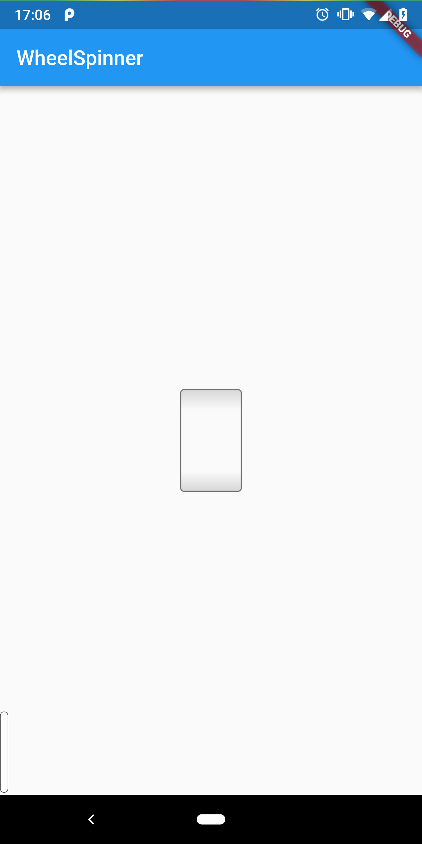
}We should see something like this:
Still no divider lines, though. Let’s say we want to divvy up our box to 10 segments, so that each
time one of them goes outside the bounding box, we increase or decrease the value by 1. In this
example we create a Stack, with 11 lines (10 for each division + 1 extra for the scroll effect)
going from top to bottom (note the lineTopPos function that gets the correct y value):
@override
Widget build(BuildContext context) {
  // ...
  decoration: // ...,
  child: Container(
    child: Stack(
      children: List<Widget>.generate(
        11,
        (i) {
          var top = lineTopPos(value, i);
          return Positioned.fromRect(
            rect: Rect.fromLTWH(0.0, top, 60, 0),
            child: Divider(
              color: Colors.grey[600],
            ),
          );
        },
      ).toList(),
    ),
  ),

  // ...
}

double lineTopPos(double value, int i) {
  double valueFraction = (value.ceil() - value) * 10.0;
  double indexedTop = 10.0 * i;
  double top = indexedTop + valueFraction;
  return top;
}
Note the line that sets valueFraction. We take our value.ceil() and reduce the current value.
This always gives us a number between 0.0 and 1.0 that tells us how much of the next segment
to show. In reality, whenever we update value, we will always consider the small fraction we are
scrolling into, which means we don’t jump by 1 every time, which will cause the lines to represent
the value correctly, and also smoothly move as we input our scroll.
Now, we have something like this:

And now that it’s all nice and pretty, let’s start handling the logic.
Step 2 - Detecting gestures and updating the value
We can now wrap our widget with a GestureDetector. This is a built-in widget that lets you capture
and use scroll, tap and multi-tap gestures on the child widget, and its decendants (that last part
depends on the behavior parameter).
//...
GestureDetector(
      onVerticalDragStart: onDragStart,
      onVerticalDragUpdate: onDragUpdate,
      onVerticalDragEnd: onDragDone,
      child: /* our widget */
),
//...
And of course, we need to actually define onDragStart, onDragUpdate and onDragDone.
1. onDragStart
We’ll start by capturing on what value and position the finger first started dragging. For that,
we will save them in our state:
Offset dragStartOffset;
double dragStartValue;

// ...

void onDragStart(DragStartDetails details) {
  setState(() {
    dragStartOffset = details.globalPosition;
    dragStartValue = value;
  });
}
2. onDragUpdate
On every update, aka when the finger slides up and down, we want to take the distance between the original start point, and use that to calculate our new value. If the finger scrolled up an amount equivalent to 10 separator lines, we increase/decrease by 10 accordingly. Of course, these numbers will be much smaller since we are updating a double, on a subpixel basis.
void onDragUpdate(DragUpdateDetails details) {
  var newValue = clamp(
      dragStartValue - (details.globalPosition - dragStartOffset).dy / 20.0,
      widget.min,
      widget.max);
  setState(() {
    value = newValue;
  });
  if (widget.onSlideUpdate != null) {
    widget.onSlideUpdate(value);
  }
}
We set the new value to use the dragStartValue and decrease by the distance of the scroll so far,
divided by 20 to scale appropriately with the separator lines. Then we update using the callback, if
that’s relevant.
Note: the clamp method is a just a convenience method to keep a number between 2 boundaries.
Here is a basic implementation:
double clamp<T extends num>(T number, T low, T high) =>
    max(low * 1.0, min(number * 1.0, high * 1.0));
3. Testing the current widget
We can already test out our widget - we still can’t “fling” the finger, but we can drag our finger up and down to see the value updating.
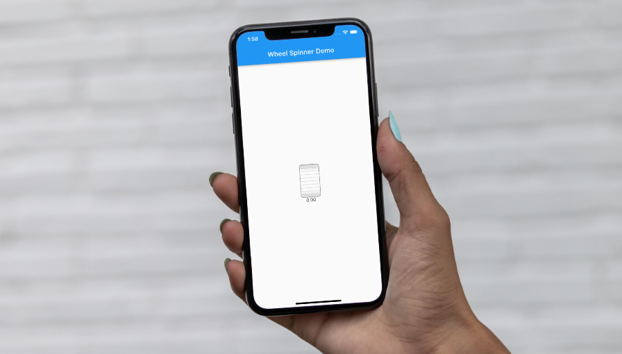
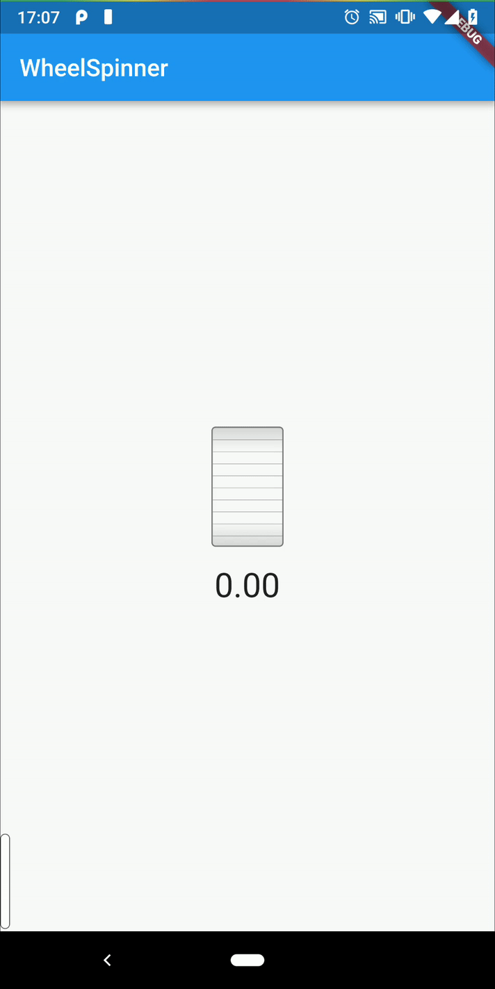
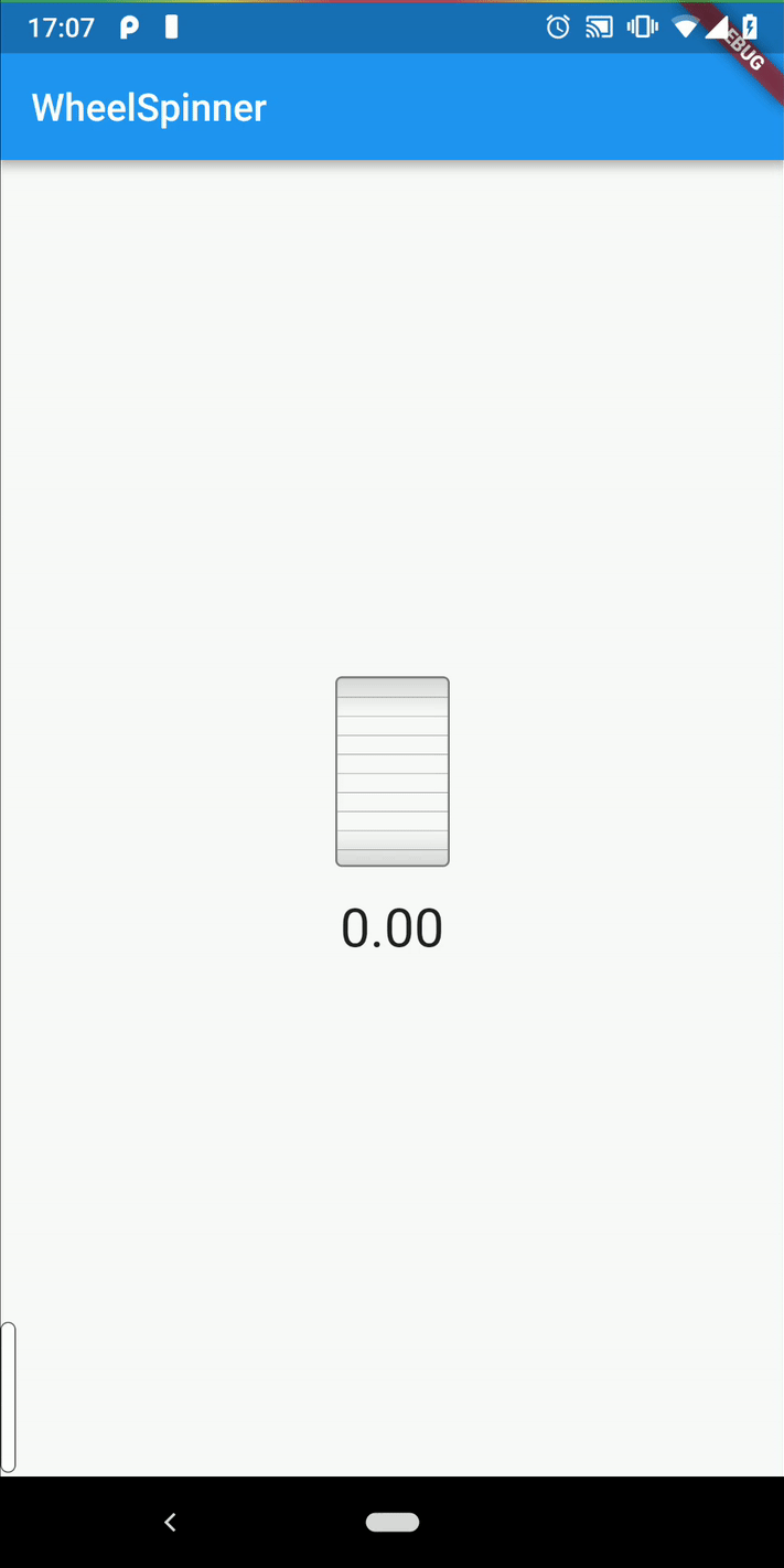
Let’s add a Text widget to our parent build method, to see the value from the state that’s calling
it. Here is an example of calling our widget:
class _MyHomePageState extends State<MyHomePage> {
  //...
  @override
  Widget build(BuildContext context) {
    return Scaffold(
      appBar: AppBar(
        title: Text(widget.title),
      ),
      body: Center(
        child: Column(
          mainAxisSize: MainAxisSize.min,
          children: <Widget>[
            WheelSpinner(
              value: _counter.toDouble(),
              min: 0.0,
              max: 100.0,
              onSlideUpdate: (val) => setState(() {
                    _counter = val;
                  }),
            ),
            Padding(
              padding: const EdgeInsets.only(top: 16.0),
              child: Text(_counter.toStringAsFixed(2), textScaleFactor: 2.0,),
            ),
          ],
        ),
      ),
    );
  }
  // ...
}
Now it should work and look like this:
4. onDragDone
Our last piece is also the most fun. Here we will start handling our “fling” physics. We need 2 things here:
- Use the velocity of the letting-go gesture to figure out how much to add/reduce from the value
- Dampen this value slowly to create an eased roll effect
Luckily, animations are super useful in a case like this, for applying curves to a path between 2 number values - we don’t need to calculate the damping ourselves.
So first thing’s first, we need to define and create a new AnimationController, and
Animation<double>, and let’s also set their initial value in our initState method:
AnimationController flingController;
Animation<double> flingAnimation;
void Function() currentFlingListener;

@override
initState() {
  flingAnimation = AlwaysStoppedAnimation(0.0);
  flingController = AnimationController(vsync: this);
  // ...
}
Also, since we use animations now, we will want to mixin SingleTickerProviderStateMixin, which
will manage a ticker for us, for the animation to use:
class _WheelSpinnerState extends State<WheelSpinner>
    with SingleTickerProviderStateMixin {
      // ...
}
Then, we can start with our new method:
void onDragDone(DragEndDetails details) {
  setState(() {
    dragStartOffset = null;
  });
  double velocity = details.primaryVelocity;
  if (velocity.abs() == 0) {
    if (widget.onSlideDone != null) {
      widget.onSlideDone(value);
    }
    return;
  }
}
In the above lines we simply reset the drag start offset, as it’s no longer relevant, now that the
finger was let go. Then we get the velocity of the drag, and if it’s 0, we return early and submit
our callback, onSlideDone with the latest value.
Now, we can proceed with handling the “fling”.
We’ll start by saving the value that was set when we first let go of the finger.
void onDragDone(DragEndDetails details) {
  // ...
  double originalValue = value;
  // ...
}
Now, we want to add a listener to our animation value. We will generate a listener based on the value that was let go at, because we will need it to calculate the updated value:
flingListener(double originalValue) {
  return () {
    double newValue =
        clamp(originalValue - flingAnimation.value, widget.min, widget.max);
    if (newValue != value) {
      setState(() {
        value = newValue;
      });
      if (flingAnimation.value == flingController.upperBound) {
        if (widget.onSlideDone != null) {
          widget.onSlideDone(value);
        }
      } else {
        if (widget.onSlideUpdate != null) {
          widget.onSlideUpdate(value);
        }
      }
    }
  };
}
In the line:
double newValue =
        clamp(originalValue - flingAnimation.value, widget.min, widget.max);
You can see we use the animation value and simply decrease it from the original value. Depending on the fling direction, this will either continue up or down along with the animation value.
Now we can set our listener to that function once we call it. Saving it to an instance variable will allow us to remove the listener on dispose, as we will have a reference to the same listener function.
  // ...
  currentFlingListener = flingListener(originalValue);
  // ...
Then we start a Tween animation: we start at 0.0, and end at velocity. Whether the velocity is
positive or negative, the math will work to reach the final number we want.
We set the curve as we want (in this case, Curves.decelerate), and attach the parent animation
controller; attach the listener, and finally when we’re done, we can use forward() to start
animating.
  flingController.duration = Duration(milliseconds: velocity.abs().toInt());
  flingAnimation =
      Tween(begin: 0.0, end: velocity / 100).animate(CurvedAnimation(
    curve: Curves.decelerate,
    parent: flingController,
  ))
        ..addListener(currentFlingListener);
  flingController
    ..reset()
    ..forward();
}
We added reset() just before forward(), to make sure no previous animations are lingering for
some odd reason. In fact, let’s add a stop() calls to onDragStart and onDragUpdate, as well,
and also reset the animation itself:
void onDragStart(DragStartDetails details) {
  flingController.stop();
  flingAnimation = AlwaysStoppedAnimation(0.0);
  // ...
}
void onDragUpdate(DragUpdateDetails details) {
flingController.stop();
flingAnimation = AlwaysStoppedAnimation(0.0);
// ...
}And now that it’s all out of the way, our widget should be fully working:
Done!
This should be pretty much it! You can of course style it and expand on it, but I’ve already made this a package, so any improvements you have, or if you just want to use it, head over to the package on Dart Pub, or feel free to contribute at the source on GitHub.
The source of the example app used for this tutorial right here, if you want to take a look and compare.
Feel free to ask questions, provide feedback or correct my mistakes in the comments - I’m sure there are some.
About the author
My name is Chen Asraf. I’m a programmer at heart — it's both my job that I love and my favorite hobby. Professionally, I make fully fledged, production-ready web, desktop and mobile apps for start-ups and businesses; or consult, advise and help train teams.
I'm passionate about tech, problem solving and building things that people love. Find me on social media: